Matplotlib is a large and sophisticated graphics package for Python written in object oriented style. However, a layer built on top of this basic structure called pyplot accesses the underlying package using function calls. We describe a simple but useful subset of pyplot here.
Let’s type the following into Python:
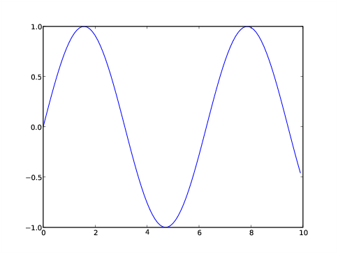
>>> from numpy import *
>>> import matplotlib.pyplot as plt
>>> x = arange(0.,10.,0.1)
>>> y = sin(x)
>>> ll = plt.plot(x,y)
>>> plt.show()
>>>
The first two lines import respectively the numpy and matplotlib
pyplot modules. The second import is of a form we haven’t seen
before. If we had typed import matplotlib.pyplot, all pyplot
functions would need to be prefixed by the cumbersome
matplotlib.pyplot. If on the other hand, we had used
from matplotlib.pyplot import *, pyplot functions could have
been used without any prefix. However, this would have left open
the possibility that pyplot functions might clash with functions
from other modules. The form used allows pyplot functions to be
prefixed with the relatively short word plt.
The next two lines define the arrays x and y which we
want to plot against each other. The command plt.plot(x,y)
performs this action, but we don’t see the result displayed on the
screen until we type plt.show(). The result is shown in
figure 4.1.
Calls to most pyplot functions return stuff that can sometimes be used
in subsequent functions. That is why we assign these return values to
variables, e. g., as in ll = plt.plot(x,y) in the above
script, even though we don’t use these values here. An advantage of
doing this is that the output is not cluttered up with obscure return
values.
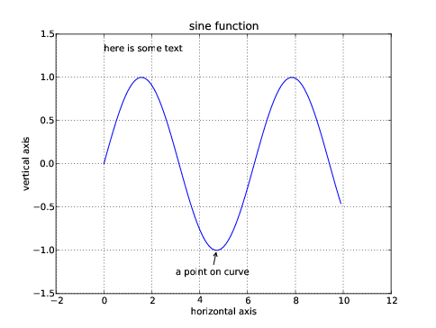
Text such as a title, labels, and annotations can be added to the plot
between the plt.plot and the plt.show commands. We can
also change the axes if we don’t like the default choice and add
grid lines to the plot:
>>> ll = plt.plot(x,y)
>>> xl = plt.xlabel('horizontal axis')
>>> yl = plt.ylabel('vertical axis')
>>> ttl = plt.title('sine function')
>>> ax = plt.axis([-2, 12, -1.5, 1.5])
>>> grd = plt.grid(True)
>>> txt = plt.text(0,1.3,'here is some text')
>>> ann = plt.annotate('a point on curve',xy=(4.7,-1),xytext=(3,-1.3),
... arrowprops=dict(arrowstyle='->'))
>>> plt.show()
>>>
The resulting plot is shown in figure 4.2. The
argument to the axis command is a list containing the lower and
upper values of the x axis followed by the same for the y axis.
The text command allows one to put arbitrary text anywhere in
the plot. The annotate command connects text with plot points
by an arrow. There are many arrow properties; we show only the
simplest case here. The operation of the x and y label commands is
clear.
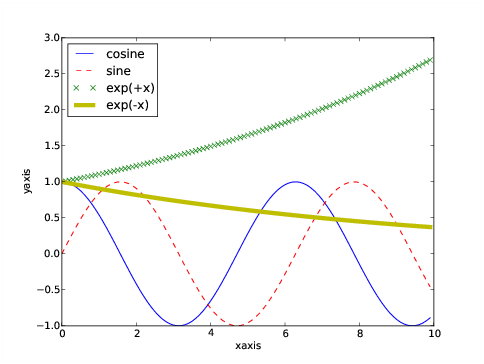
More complicated plots with multiple lines and line types can be made:
>>> x = arange(0.,10,0.1)
>>> a = cos(x)
>>> b = sin(x)
>>> c = exp(x/10)
>>> d = exp(-x/10)
>>> la = plt.plot(x,a,'b-',label='cosine')
>>> lb = plt.plot(x,b,'r--',label='sine')
>>> lc = plt.plot(x,c,'gx',label='exp(+x)')
>>> ld = plt.plot(x,d,'y-', linewidth = 5,label='exp(-x)')
>>> ll = plt.legend(loc='upper left')
>>> lx = plt.xlabel('xaxis')
>>> ly = plt.ylabel('yaxis')
>>> plt.show()
>>>
The third argument of the plot command is an optional string, the
first character of which is a color; one of "b", "g",
"r", "c", "m", "y", "k", and
"w" – mostly obvious, except "k" indicates black. The
second and following characters indicate the line type. Types
"-", "--", "-.", and ":" indicate
solid, dashed, dash-dotted, and dotted lines respectively. Other
types indicate markers: ".", "x", "+",
"o", and "*" are fairly obvious. There are numerous
other choices as well. In addition to the positional arguments, there
is a large list of keyword arguments to the plot command. Perhaps the
most useful is the linewidth, which is given in points.
The label argument in the plot command is used later by the
legend command, which draws a legend in the specified location.
Location choices are strings of the form 'upper left',
'lower center', 'right', etc. Alternatively, the
loc argument may be omitted and Matplotlib puts the legend
where it sees fit.
The resulting plot is shown in figure 4.3.
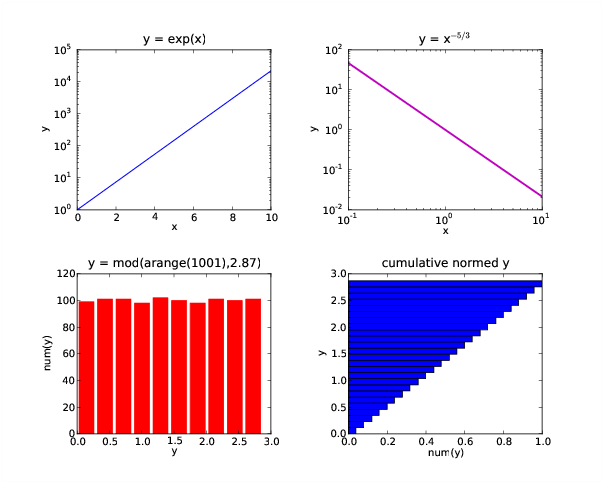
A variety of other one-dimensional plotting modes are available in Matplotlib. The following script illustrates logarithmic plots and histograms:
#!/usr/bin/python
#
# variety.py -- Make a variety of plots in a single figure

from numpy import *
import matplotlib.pyplot as plt

fg = plt.figure(figsize=(10,8))
adj = plt.subplots_adjust(hspace=0.4,wspace=0.4)

sp = plt.subplot(2,2,1)
x = linspace(0,10,101)
y = exp(x)
l1 = plt.semilogy(x,y,color='m',linewidth=2)
lx = plt.xlabel("x")
ly = plt.ylabel("y")
tl = plt.title("y = exp(x)")

sp = plt.subplot(2,2,2)
y = x**-1.67
l1 = plt.loglog(x,y)
lx = plt.xlabel("x")
ly = plt.ylabel("y")
tl = plt.title("y = x$^{-5/3}$")

sp = plt.subplot(2,2,3)
x = arange(1001)
y = mod(x,2.87)
l1 = plt.hist(y,color='r',rwidth = 0.8)
lx = plt.xlabel("y")
ly = plt.ylabel("num(y)")
tl = plt.title("y = mod(arange(1001),2.87)")

sp = plt.subplot(2,2,4)
l1 = plt.hist(y,bins=25,normed=True,cumulative=True,orientation='horizontal')
lx = plt.xlabel("num(y)")
ly = plt.ylabel("y")
tl = plt.title("cumulative normed y")

plt.show()
The semi-log and log-log plots are largely self-explanatory. The plot command semilogx places the log scale along the x axis. The histogram plots are similarly simple. The rwidth option specifies the width of the histogram bars relative to the bin size, with a default of 1. The cumulative option plots a cumulative distribution and normed causes the integral of the distribution to be unity in the non-cumulative case. In the cumulative case the last histogram bar has a length of unity.
We now learn how to make two-dimensional plots of various kinds. These plots are created from two-dimensional NumPy arrays. In these arrays the second dimension (the column index) corresponds to the horizontal axis of the plot while the first dimension (the row index) corresponds to the vertical axis. Thus, arrays are plotted the same way they are printed, except that plots go from the bottom up while printing goes from the top down.
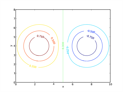
Here is the simplest way to make a contour plot:
>>> x = linspace(0,10,51)
>>> y = linspace(0,8,41)
>>> (X,Y) = meshgrid(x,y)
>>> a = exp(-((X-2.5)**2 + (Y-4)**2)/4) - exp(-((X-7.5)**2 + (Y-4)**2)/4)
>>> c = plt.contour(x,y,a)
>>> l = plt.clabel(c)
>>> lx = plt.xlabel("x")
>>> ly = plt.ylabel("y")
>>> plt.show()
>>>
The result is shown in figure 4.5. The first four lines in
the above script create the two-dimensional array a, which is
then contoured contour(x,y,a). The x and
y are optional in this command, but if they are omitted, the
axes default the the range [0,1].
The contour command doesn’t produce contour labels on its own; this
action is provided by clabel(c). Note that the value returned
by the contour function is needed by the clabel function to generate
the proper labels.
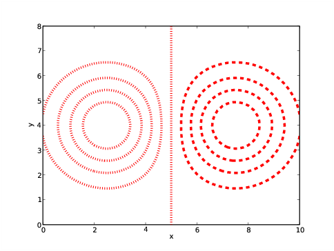
A sequence (tuple or list) of values can be used to define the levels contoured. Furthermore, various keyword arguments can be used to modify the presentation. The keyword colors can be used to define the color of the contours (using the color values indicated previously) and the keyword linewidths can be used to specify the width of lines. The style of lines can be set by the keyword linestyles, taking the possible values solid, dashed, dashdot, and dotted:
>>> c = plt.contour(x,y,a,linspace(-1,1,11),colors='r',linewidths=4,
... linestyles='dotted')
>>> lx = plt.xlabel("x")
>>> ly = plt.ylabel("y")
>>> plt.show()
>>>
The result is shown in figure 4.6. Notice that regardless
of the specified line style, Matplotlib insists on making negative
contours dashed as long as a single color is specified! A solution is
to fool Matplotlib into thinking multiple colors are being requested,
by, for instance, specifying colors=('r','r') the the call to
contour. This mechanism can also be used to (truly) specify different
contour colors as well as different line widths and styles for
different contours. The specified values are applied in sequence from
negative to positive contours, repeating as necessary.
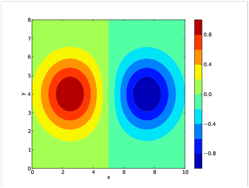
An alternate type of contour plot fills the gaps between contours:
>>> c = plt.contourf(x,y,a,linspace(-1,1,11))
>>> b = plt.colorbar(c, orientation='vertical')
>>> lx = plt.xlabel("x")
>>> ly = plt.ylabel("y")
>>> ax = plt.axis([0,10,0,8])
>>> plt.show()
>>>
The result is shown in figure 4.7. The colorbar()
command shown produces the labeled color bar on the right side of the
plot. If orientation='horizontal', the color bar appears below
the plot.
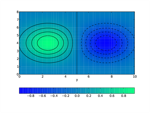
The function pcolor produces a plot similar to that produced by contourf except that the color distribution is continuous rather than discrete. For example:
>>> ac = 0.25*(a[:-1,:-1] + a[:-1,1:] + a[1:,:-1] + a[1:,1:])
>>> c = plt.pcolor(x,y,ac)
>>> d = plt.colorbar(c,orientation='horizontal')
>>> q = plt.winter()
>>> e = plt.contour(x,y,a,linspace(-1,1,11),colors='k')
>>> lx = plt.xlabel("x")
>>> ly = plt.xlabel("y")
>>> plt.show()
>>>
The first statement of this script computes grid-centered values of
the array a. This is strictly necessary to align the plot
properly with the axes, since pcolor centers its pixels on grid boxes
whereas contour and contourf assume that a is defined on grid
edges. However, for very small small grid boxes the half-grid
displacement may be insignificant.
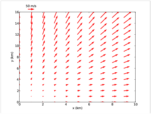
Vector plots can also be made in Matplotlib. Here is a script producing a vector plot and a key showing the scale of the vectors:
>>> x = linspace(0,10,11)
>>> y = linspace(0,15,16)
>>> (X,Y) = meshgrid(x,y)
>>> u = 5*X
>>> v = 5*Y
>>> q = plt.quiver(X,Y,u,v,angles='xy',scale=1000,color='r')
>>> p = plt.quiverkey(q,1,16.5,50,"50 m/s",coordinates='data',color='r')
>>> xl = plt.xlabel("x (km)")
>>> yl = plt.ylabel("y (km)")
>>> plt.show()
>>>
The quiver command produces vector plots from two-dimensional
arrays (u and v in this case) containing the vector
component values. The grid on which the vectors are plotted is
defined by the first two arguments of quiver – the two-dimensional
arrays X and Y in this case. However, quiver will
accept the original one-dimensional axis vectore x and y
as well. The color of the vectors is specified in the usual fashion
with the color keyword.
The quiver arguments angles='xy' and scale=1000 are very
important. Setting the angles keyword to 'xy' means
that the vector components are scaled according to the physical axis
units rather than geometrical units on the page. The actual scaling
factor which multiplicatively converts vector component units to
physical axis units is width/scale where width is the width of the
plot in physical units and scale is the number specified by the
scale keyword argument of quiver. In our example width = 10
km and scale = 1000, so vectors are plotted to a scale of
0.01 km / ( m / s). The angle keyword
argument is not available in versions of Matplotlib earlier than 0.99,
which is a serious omission.
The quiverkey command produces a legend consisting of a single vector and a label indicating how long it is in physical units. In order, the positional arguments are (1) the variable returned by the quiver command, (2) and (3) the x and y coordinates of the legend, (4) the length of the arrow in physical units, and (5) the legend label. The keyword argument coordinates tells Matplotlib which units define the legend location; the most useful are ’axes’, in which x and y range from 0 to 1 across the plot and ’data’ in which physical axis coordinates are used. As in the above example (which is shown in figure 4.9), the legend may be located outside of the actual plot.
Matplotlib honors the NumPy conventions for masked arrays, in that masked regions of two-dimensional plots are omitted.
The use of masked arrays with vector plots and filled contour plots is a bit buggy at this point. For vectors, it is best to eliminate masked arrays in favor of arrays which give vectors zero length in masked regions. Hopefully this situation will improve in subsequent version of Matplotlib.
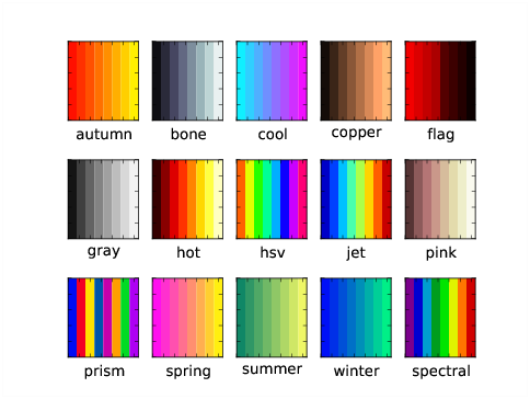
Figure 4.8 illustrates the use of an alternate color map,
in this case, winter, generated by the winter()
function. Colormaps provided by Matplotlib include autumn,
bone, cool, copper, flag, gray,
hot, hsv, jet, pink, prism,
spring, summer, winter, and spectral and
each has its associated function call. Figure 4.10
illustrates each of these colormaps. The default is jet.
An alternate way to set a color is by specifying its additive RGB
value in a hex string. The hexadecimal digits are (1, 2, 3, ..., 9,
a, b, c, d, f), so pure red is '#ff0000', pure green is
'#00ff00', and pure blue is '#0000ff', while black is
'#000000' and white is '#ffffff'. With this scheme each
primary color has 256 possible values, which is precisely the number
that an eight bit unsigned integer can provide. So, for instance,
bright yellow, which is a mixture of red and green, is specified by
color='#ffff00', and a darker red and a lighter blue would be
obtained respectively from color='#aa0000' and
color='aaaaff'.
Various global options can be set directly in the rcParams
dictionary of Matplotlib, which contains default settings for many
variables. Set any desired entries before invoking any other plotting
commands. Since rcParams is a dictionary, the dictionary keys can be
printed with the command plt.rcParams.keys() and the current
value of a particular key (such as font.size) can be listed
with plt.rcParams['font.size'].
The key font.size sets the default font size in plots. The default
size of 12 pts is generally too small for presentation plots.
Increasing this to 16 pts may be done with the command
plt.rcParams['font.size'] = 16.
Increasing the font size can cause axis labels to overlap – Matplotlib is not (yet) smart enough to compensate for this. Axis numerical labeling can be changed using the xticks and yticks commands. (Recall that the xlabel and ylabel commands take care of the axis name labels.) For example, the command
>>> tx = plt.xticks(linspace(5,25,5))
labels the x axis with the numerical values 5, 10, 15, 20, 25. In general, the argument of the xticks command is a list or array with the desired numerical labels, starting at the left end of the axis and ending at the right end. The yticks command works similarly for the y axis.
A similar problem can arise with colorbar labels, especially if the color bar is horizontally oriented. The solution here is a keyword argument to the colorbar command named ticks. So, for example, one could use
>>> plt.colorbar(c,orientation='horizontal',ticks=linspace(-1,1,5))
to define the spacing of the labels on the color bar.
By default Matplotlib does some fancy footwork to eliminate line plotting commands that overlap other lines of the same type, and therefore would not be visible. However, this procedure can on occasion backfire, resulting in strange plotting behavior. If a problem of this type is suspected, this procedure can be turned off with the command
>>> plt.rcParams['path.simplify'] = False
This command (like other assignments to rcParams) should be issued before any actual plotting commands.
Technically, before issuing any plotting commands, the figure command must be issued. However, pyplot takes care of this in simple cases with the default creation of a figure with dimensions 8 by 6 inches (when printed on paper). If different figure dimensions are desired, the figure command needs to be called explicitly with the figsize keyword argument.
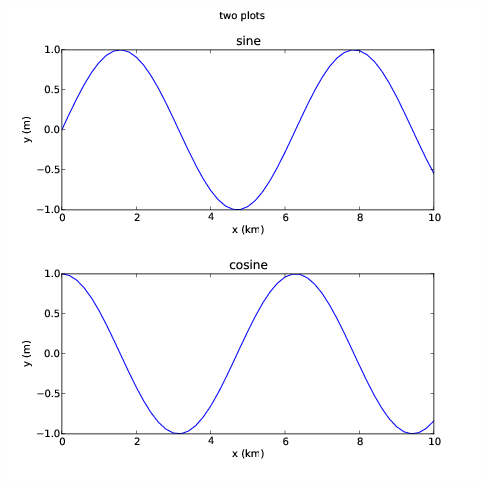
Figures with multiple plots can be created using the subplot command. This command has three arguments, the number of rows of plots in the figure, the number of columns, and the particular plot being created next:
>>> x = arange(0.,10.1,0.2)
>>> a = sin(x)
>>> b = cos(x)
>>> fig1 = plt.figure(figsize = (8,8))
>>> plt.subplots_adjust(hspace=0.4)
>>> p1 = plt.subplot(2,1,1)
>>> l1 = plt.plot(x,a)
>>> lx = plt.xlabel("x (km)")
>>> ly = plt.ylabel("y (m)")
>>> ttl = plt.title("sine")
>>> p2 = plt.subplot(2,1,2)
>>> l2 = plt.plot(x,b)
>>> lx = plt.xlabel("x (km)")
>>> ly = plt.ylabel("y (m)")
>>> ttl = plt.title("cosine")
>>> sttl = plt.suptitle("two plots")
>>> plt.show()
>>>
The results are shown in figure 4.11. Notice that an
“ubertitle” can be created using the suptitle command.
Unfortunately, the font size of the ubertitle is less than the font
size of the subplot titles. However, the font size of both title and
ubertitle can be adjusted with the keyword parameter fontsize,
e. g., fontsize=16.
The plt.subplots_adjust(hspace=0.4) command increases the
height spacing of subplots from its smaller default value. This keeps
the x axis label in the upper plot from overlapping with the title of
the lower plot. Another optional keyword parameter for the
subplots_adjust command is wspace, which solves similar
problems for horizontal spacing. The use of the
plt.subplots_adjust command is also illustrated in figure
4.4. Other options for plt.subplots_adjust are
left, right, bottom, and top. These
adjust overall plot margins. Multple options separated by commas can
be used in a single plt.subplots_adjust call.
Matplotlib still has some rough edges when it comes to font size and plot spacing, but at least the tools to fix these problems are available!
Figure 4.7 demonstrates that line plots (e. g., plots
produced by plot, contour, quiver, etc.) can be
overlayed on a filled contour or a pcolor plot. In addition, line
plots may be overlayed on each other. We can exert fine control over
the order in which these are plotted using the zorder keyword
option in these plotting commands. For instance including
zorder=0 in one plot and zorder=5 in another makes the
second plot appear on top of the first. Text always appears on top
of all graphics.
The call to show() in the above examples pops up a window with your plot. Various icons are displayed at the bottom of the window which allow you to manipulate the plot in various ways such as zooming in, changing the aspect ratio, etc. The right-most icon pops up a window which allows you to specify an output file for the plot. Various image formats are available as well as postscript, encapsulated postscript, and PDF.
The Matplotlib page at Sourceforge http://matplotlib.sourceforge.net/ is the primary reference for Matplotlib. This documents all plotting commands and has a link to a User Guide. The latest source code can also be downloaded here.
The version documented here is 0.99.1. As noted, a few serious omissions make versions earlier than 0.98 less useful for certain purposes.